2025 Web Design Trends
By Philipp on
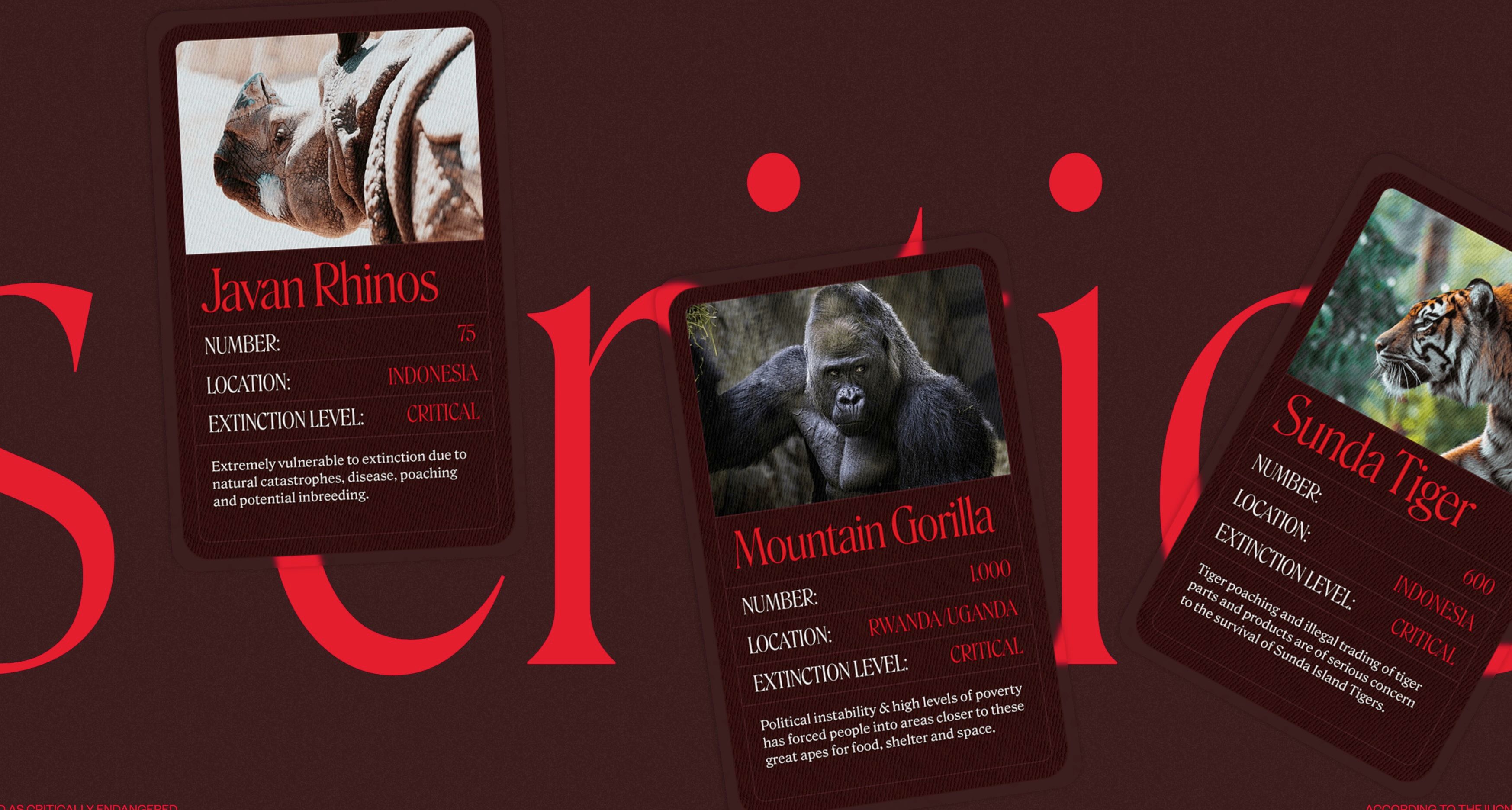
Have a look at the critical danger website.
This website from 2023 is the quintessential idea of what web design in 2025 has become. The overly reliance on usability and user flow has made way to websites that are not easy to digest. Websites with a lot going on and scrollytelling effects. All of which embodied nicely in the above mentioned website. And hey: the effect of making it uncomfortable and difficult fits very well in that case. But it might not work too well in others. So the following list of trends should be taken with a grain of realistic understanding.
Scrollytelling
Scrollytelling is a mix of scrolling and storytelling. As users scroll down a page, content unfolds in a dynamic and interactive way, often using visuals, movement, and layered text. It helps explain ideas step by step and keeps users engaged. A great example is The New York Times' Snow Fall, which helped popularize this technique.
Website builders have rushed into this space to enable scrollytelling. Webflow and Framer are the typical contenders, but also Elementor has created a scrollytelling option. In Webstudio, you can also start scrollytelling, but the functionality is still being updated and rolled out.
Word of Warning: Scrollytelling is very resource intensive and slower internet connections might have difficulty coping with it. Webflow also has issues integrating modern animations into its overall suite. While scrollytelling can be fantastic, it often takes away from usability and then it is less engaging than planned.
Animations Everywhere
Ok, this is directly connected with Scrollytelling and with the broader issue that fast, performant sites might be seen as boring.
Subtle animations are now part of almost every modern website. Buttons respond when hovered, images slide into view, and menus expand smoothly. These micro-interactions make a site feel alive and guide users through actions without words. A strong example is Stripe's homepage, where every element is animated with purpose.
"Conflicting Principles: DRY — Don’t Repeat Yourself vs. High Cohesion" Oleg Isonen in his 2018 medium article
On a technical side, do you really want to build always new animations? But if you have solid animations that you reuse a lot, doesn't it get too repetitive and boring? Or God forbid, what if you create clean articles without any animations...
Non-Alignment
Non-Alignment is the trend that breaks up the grid or flexbox. Horizontal and vertical lines will be broken up and there are diagonal lines and shapes. Not really a new trend in 2025, but a trend that is still somewhat gaining popularity on a web that is still 99% rectangular. Guerriero and Kennedy wrote articles about it in 2019 and 2020 respectively. Compared to animations, it is also not too demanding and won't negatively affect website speed.
Designers are moving away from rigid grids. Elements like text, images, and buttons are often placed in unexpected or asymmetrical positions. This creates a more artistic, editorial feel and draws the eye in new directions. You can see this trend in action on sites like Codepen, which hosts many creative portfolios with off-grid layouts.
Neon Color and Dark Mode
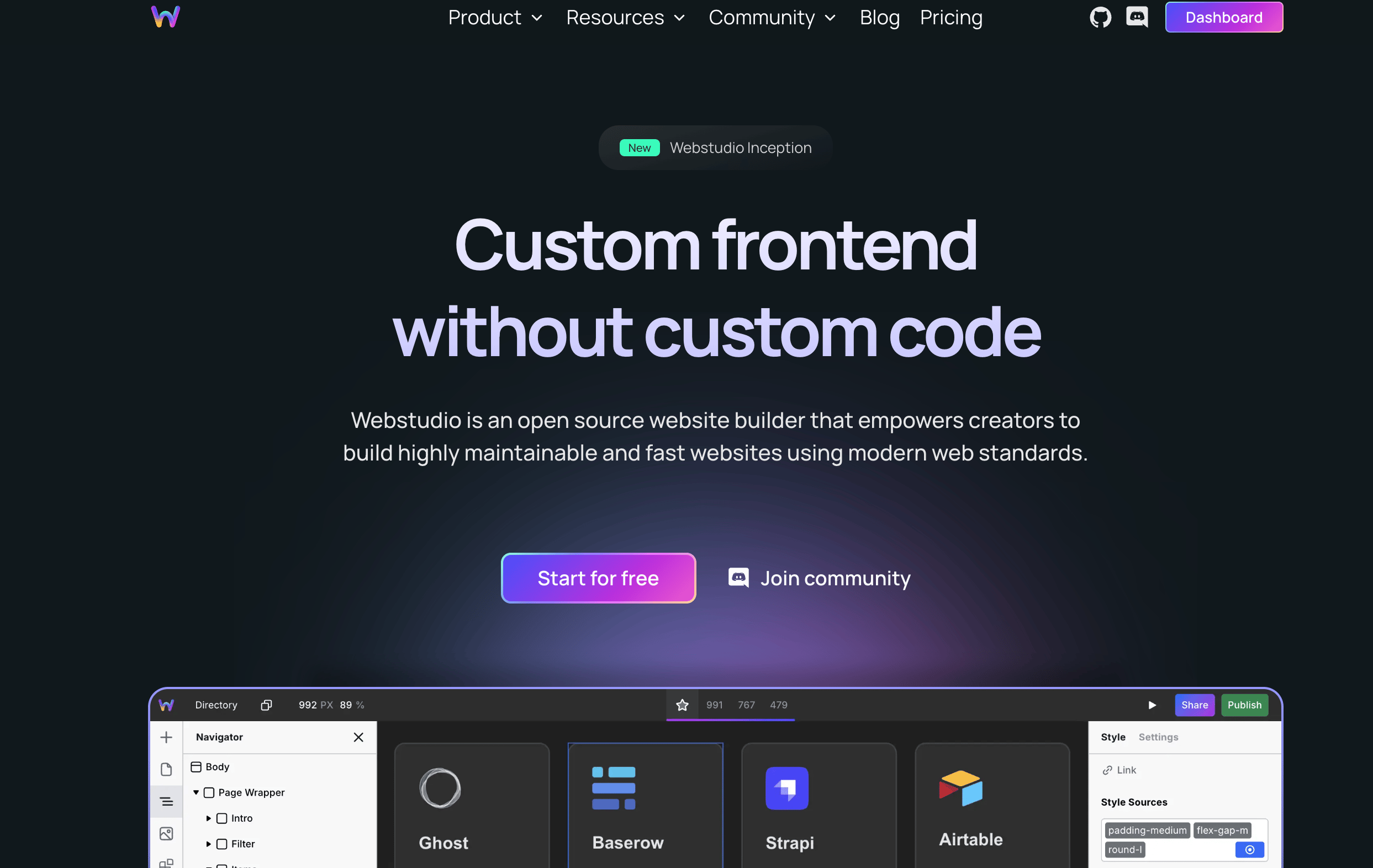
Neon color palettes paired with dark backgrounds are still gaining popularity. The peak might have been reached in 2021 and early 2022 when concurrently crypto projects were the most exciting thing in town. These high-contrast designs stand out on screens and give a futuristic, tech-inspired vibe. Dark mode also reduces eye strain and saves energy. One example of this look is Webstudio, the very website builder that we love.
A look ahead
In the end, design should bring user intent and content together. As such, the new trends might be very useful for some cases (techies like dark mode, environmentalists grave the disturbing web experience of critical danger), but many other use cases probably ask for simpler, clearer design.